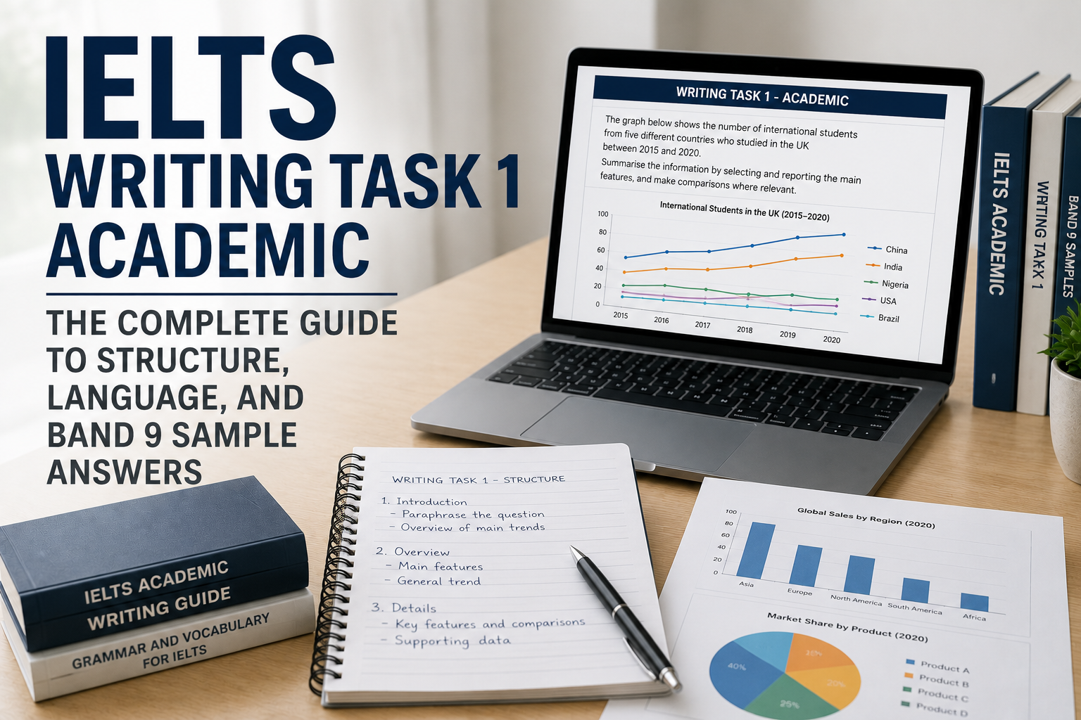
IELTS Academic Writing Task 1 asks you to select and describe the main features of visual information. A useful response tells the reader what the visual shows, gives a clear overview, and supports the important comparisons with accurate details. Start by understanding the data, then choose language that expresses it precisely.
Official guidance checked: 20 September 2026. This guide includes three original data tasks with overview exercises and a complete practice answer for the first table. The sample is a teaching example, not an examiner-awarded Band 9 script.
Format and scoring · Plan the response · Try the original task · Choose an overview · Read the sample · Try two more overview drills · Other visual types
Task 1 format and the four assessment criteria
The official Academic Writing format requires at least 150 words for Task 1 and recommends about 20 minutes. The full Writing test lasts 60 minutes, and Task 2 contributes twice as much to the Writing score. Write connected sentences in an academic or neutral style, rather than notes or bullet points.
The assessment covers Task Achievement, Coherence and Cohesion, Lexical Resource, and Grammatical Range and Accuracy. Use those headings when reviewing a response: check the information selected, the organisation, the word choices and the sentence control.
If you need to write a letter, you are looking for General Training Task 1. For an argument or discussion essay, use the Task 2 guide. This page focuses on Academic visual reporting.
A practical structure, without a rigid template
IELTS's Task 1 teaching guidance recommends a short introduction, an overview of the main patterns, and supporting details grouped logically. It also explains that the grouping depends on the data and that a separate conclusion is unnecessary.
For the example below, four paragraphs are convenient: an introduction, an overview, one paragraph for car and bus travel, and one for cycling and walking. That is a planning choice, not a compulsory paragraph count.
- Read the labels first. Identify who or what is measured, the unit, place and dates. Check whether the values are counts, percentages or another measure.
- Choose the big picture. Find the largest categories, the most important changes and any meaningful exceptions. A list of every number is not an overview.
- Group supporting details. Put related categories or stages together so each paragraph has a purpose. Use enough figures to demonstrate the pattern.
- Check your interpretation. Keep causes, opinions and predictions out unless the visual actually supplies that information.
Original practice task: how students travelled to campus
The table gives the percentage of students at a fictional university who used each main travel mode in 2015 and 2025. Describe the important features and compare the two years. Write at least 150 words. The data are invented for this exercise and do not describe a real institution.
| Mode | 2015 | 2025 |
|---|---|---|
| Car | 55% | 35% |
| Bus | 20% | 35% |
| Cycling | 10% | 20% |
| Walking | 15% | 10% |
Before writing, identify the largest category in each year, the biggest change in percentage points, and the category that doubled. Then decide which facts belong in an overview and which are better used as supporting detail.
Which overview represents the table accurately?
Option A: Overall, car travel remained the most common mode in both years, while every other form of transport became more popular.
Option B: Overall, the share travelling by car fell substantially, while bus use and cycling increased. By the end of the period, car and bus travel were equally common, and walking was the least used mode.
Choose before revealing the explanation. Check each statement against the table rather than choosing the sentence that sounds more sophisticated.
Reveal the overview check
Option B fits the data. Car and bus are tied at 35% in 2025, so Option A incorrectly presents car travel as the sole leader. Option A also says every other mode increased, although walking fell from 15% to 10%.
Option B selects the main changes and the final ranking. The body paragraphs can supply the numbers that support it. Now write your own overview using different wording, then check the same two facts: the final tie and the decline in walking.
Continue with IELTS Academic Writing practice when you are ready to attempt another task and review feedback.
Complete sample answer for the original table
Read the answer after attempting your own. Compare its selection and grouping of information, rather than memorising its wording.
The table compares the proportions of students at a university who travelled to campus by car, bus, bicycle or on foot in 2015 and 2025.
Overall, car use declined considerably, while buses and bicycles accounted for larger shares of student travel. Cars and buses were equally common by 2025, and walking had become the least popular of the four modes.
In 2015, cars were used by a majority of students, at 55%, whereas only 20% took the bus. Over the following decade, the share travelling by car fell by 20 percentage points to 35%. Bus use moved in the opposite direction, rising by 15 points to reach the same level. Together, these two modes were used by 70% of students in 2025, compared with 75% in the earlier year.
Cycling also increased, doubling from 10% to 20%. In contrast, the proportion walking decreased from 15% to 10%. Consequently, cycling overtook walking and became twice as common by the end of the period, although it remained below both car and bus travel.
What the sample does, paragraph by paragraph
- Introduction: identifies the university population, four categories and two dates without claiming to know why travel habits changed.
- Overview: summarises direction and the final ranking. It does not simply repeat the table headings.
- First detail paragraph: groups car and bus together because their gap closes to a tie, supported by starting and ending figures.
- Second detail paragraph: compares the two smaller categories and explains the reversal in their ranking.
The combined car-and-bus percentage is a calculation from the supplied data: 55 + 20 = 75 in 2015 and 35 + 35 = 70 in 2025. It does not introduce an outside fact. The answer does not claim that traffic policies, fuel prices or environmental attitudes caused the changes, because the table supplies no such evidence.
Two more overview drills: comparison and changing ranks
These original fictional tables isolate two different decisions: comparing groups at one point in time, and summarising changes between two dates. Write a one- or two-sentence overview in your own notes before opening each explanation. This short exercise is free to read and self-check; it does not record your writing or award a band. A complete Task 1 response still needs at least 150 words.
The official Task 1 assessment criteria emphasise selecting important features, reporting them accurately and making relevant comparisons. They distinguish description of the supplied information from speculative explanations. These points were rechecked on 7 October 2026.
Drill 1: compare age groups without inventing a trend
A fictional adult-learning centre surveyed learners in 2025 about their preferred course format. Each person selected one format. The percentages within each age group add to 100%; the number of people in each group is not supplied.
| Age | Online | In person |
|---|---|---|
| 18–24 | 70% | 30% |
| 25–44 | 55% | 45% |
| 45+ | 35% | 65% |
A: Overall, online learning became more popular over time, especially because younger people were better at using technology.
B: Overall, online courses were preferred by a majority in the two younger groups, whereas in-person learning was more popular among those aged 45 and above. The middle age group showed the smallest difference between the two formats.
C: Overall, most learners at the centre preferred online courses, and the oldest group contained the largest number of in-person learners.
Reveal the age-group overview answer
B is supported by the table. Online preference exceeds half in the first two groups, while in-person preference exceeds half in the oldest group. The gaps are 40, 10 and 30 percentage points respectively, making the middle group's preferences the closest.
A invents both a change over time and a cause. There is only one survey year, and no information about technology skills. C combines percentages from groups of unknown sizes: the table cannot establish the centre-wide majority or the largest absolute number of learners.
Your writing turn: explain the contrast without using “increased”, “decreased” or a cause. You could begin: “Online study was favoured in the younger groups, while…” Keep the group names precise. Then write one supporting comparison with figures from a single age group.
Drill 2: identify the new leader and the exception
The next fictional table shows completed repair jobs at three workshops in 2020 and 2025. All figures are counts of jobs, measured in the same way in both years. The table gives no observations for the intervening years.
| Workshop | 2020 | 2025 |
|---|---|---|
| East | 40 | 85 |
| North | 70 | 60 |
| West | 30 | 55 |
A: Overall, every workshop completed more jobs in 2025, although North remained the busiest.
B: Overall, East grew steadily throughout the period because it hired more staff, while West fluctuated.
C: Overall, the combined number of completed jobs was higher in 2025. East replaced North as the busiest workshop, while North was the only workshop to record a decline.
Reveal the workshop overview answer
C captures the main changes. Total jobs rose from 140 to 200. East had the largest numerical increase, from 40 to 85, and finished ahead of North's 60. North fell from 70 to 60, whereas West rose from 30 to 55.
A misses both the change in leader and North's decline. B invents staffing information and the path between the two observations. Two dates do not establish steady growth or repeated fluctuations.
Your writing turn: write an overview that includes the change in leader and the exception, using your own words. Then support East's increase in a detail sentence: 85 − 40 = 45 jobs. That is a change in a count, not 45 percentage points. Keep West's smaller increase for a useful comparison instead of listing every figure in the overview.
Review your two overviews against the evidence: did you compare the right groups, preserve the units and avoid unsupported causes? If you missed a feature, revise that sentence before attempting a complete response. For another task and feedback, continue with IELTS Academic Writing practice. Free allowances and paid plans determine platform access.
Language check: percentages, comparisons and change
“Fell to” gives the final value; “fell by” gives the amount of change. Car use fell to 35%, or by 20 percentage points. Saying it fell by 20% would describe a different calculation: 20 divided by the original 55 is about 36.4%. Use percentage points when directly subtracting two percentages.
Use “doubled” for cycling because 20 is twice 10. Use “equal” for car and bus in 2025 because both are 35. Avoid “fluctuated” here: two observations show a difference between dates, not a series of rises and falls. Similarly, the table does not establish that a change happened steadily during every year in between.
Accuracy matters more than replacing every ordinary word. “Increased”, “decreased” and “remained” are useful when they fit the data. A dramatic adjective is unhelpful if the numbers do not justify it.
How to adapt your approach to other visual types
- Bar charts: compare category sizes and rankings. If more than one year is shown, check which rankings or gaps change.
- Line graphs: follow the time axis, then identify major trends, turning points and intersections. Do not describe a temporary peak as the final value.
- Pie charts: compare shares of the same whole. When two charts show different totals, a smaller percentage does not automatically mean a smaller absolute number.
- Tables: find useful groupings rather than reading every cell in order. The worked example groups the two largest modes, then the two smaller ones.
- Processes: establish the start, end, sequence and any repeated cycle. Follow the supplied stages; do not add equipment or actions that are absent.
- Maps: identify the main land-use or layout changes and the features that remain. Check direction and location carefully before describing an addition or replacement.
- Mixed visuals: explain what each visual measures before connecting them. Do not compare unlike units as though they were the same quantity.
For additional authentic task formats, use the official Academic sample questions. The table above is BandLadder's original practice material, not a recalled or predicted exam question.
What Band 7–9 criteria mean for your practice
The official Writing descriptors, updated May 2023, describe a clear overview and appropriate grouping among the Task Achievement features at Band 7. Higher bands require stronger fulfilment of the task and control across the other criteria too. Band 9 is not earned by one overview sentence or a fixed template.
Use the full descriptors to assess a complete response. This article has not had its sample awarded a band by an IELTS examiner, and the overview exercise does not calculate your Writing band. In practice, ask for specific feedback on an inaccurate comparison, unclear grouping or recurring language error, then test the correction on a new visual.
A 20-minute practice routine
Try this starting allocation and adjust it to your needs: three minutes to read and group the data, fourteen minutes to write, and three minutes to check. It is a practice routine, not an official split within Task 1.
- Have you included an overview that matches the whole visual?
- Are the main features supported with correct figures or stages?
- Have you kept the units, dates and category names consistent?
- Have you written at least 150 words in connected prose?
- Can you remove an invented cause, repeated point or inaccurate comparison?
For your next session, write a fresh overview before looking at any example. Then complete the response and review one issue under each assessment heading. Our 30-day IELTS study plan can help you organise regular practice alongside the other skills.
Start free IELTS Academic Writing practice. BandLadder offers 30k+ IELTS and 25k+ PTE questions across supported exams, with AI feedback, mock-test and prediction resources. Free allowances and paid plans determine access. Use practice feedback to guide improvement; it is not an official IELTS result.